SmartThings
IoT solution for Smart Home
Overview
Project Brief
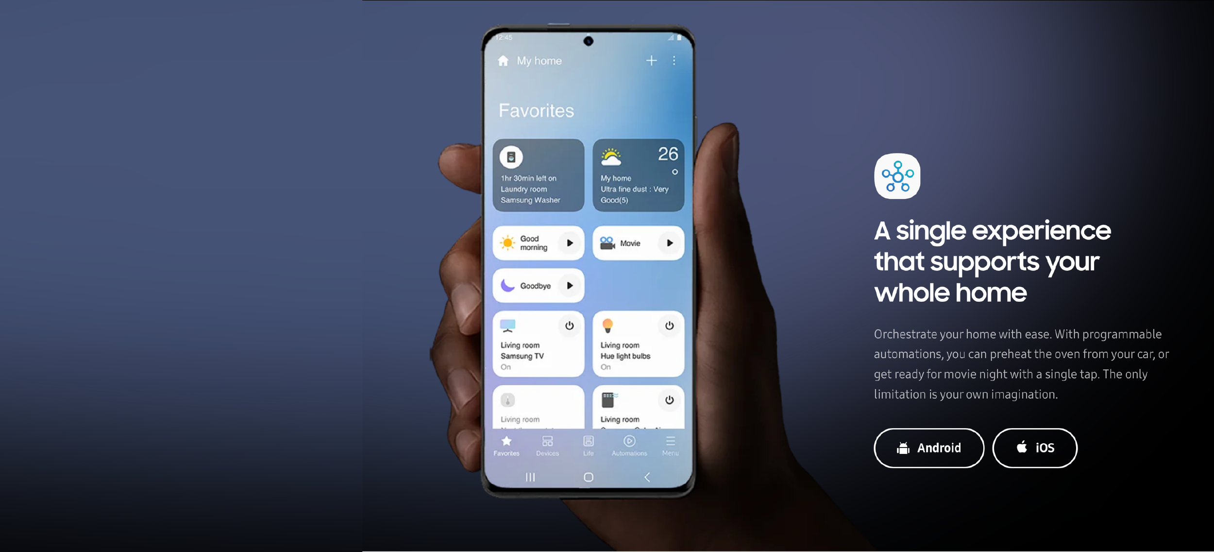
“SmartThings” is the application that users can monitor and remotely control smart devices automatically to manage daily life.
I renewed this application as a TF member at 2021. From research to UX strategy, UX flows, and A/B testing, I participated all design process as a core member. After releasing, I was in charge of “Life tab, Set-up, and Design system for in-app services”.
Role
UX Research, Interview (FGI), Information Architecture, UX flow, User Interface design.
Duration
2020.01~2022.01
What was the problem?
Previous version of “SmartThings” was too much focused on just ‘home device control’, so it was assessed as too technical. Such User Interface made users give up exploring various features, routines and services.
Previous SmartThings UI analysis
Main challenges.
Main UX challenge : Users have different level of understanding in IoT.
-
Making balance of app complexity by considering both users type - who are familiar with IoT & who are not.
-
Since users control not only sensors and lights, but also TV, refrigerator, door locks etc, each device control screen should be customized that device feature, but have consistency in the total-view.
-
Users don’t know convenient features - such as automation, in-app services. Therefore, there should be some point to let users know.
Process summary.
I participated as a member of a Task Force team, developing the next version of SmartThings (SmartThings 3.0). Our team was consisted of UX designers, project managers, engineers, and user testing group.
Problem Solving
Over three months, I used both qualitative and
quantitative analysis — including KJ mapping, user interviews, User Journey maps, and AB testing.
Design Strategy
After analyzing users’ voice and market trend, three design strategies come up.
Persona
SmartThings app should be used by all ages - from child to elderly, I made three types of persona.
UI Development
When developing UX, we categorized function as three.
1) Friendly guideline to help people soft-landing, 2) Simple and intuitive app structure for easily find features, 3) Control system that people can clearly check condition and edit.
Developing UX based on ‘Data’
When developing features, IA and UX flow, we used SA logging (Samsung Analytics, real app usage data) and VOC from Google & iOS app store.
1. SA Logging : App access path, Page dropout rate, Page turnover rate.
Total ST user / Active user’s rate (within 30days) : around 20%
Device Owner / Active user’s rate : around 85%
Insight : Main target is ‘Device owner’ rather than users who just share devices.
1) Importance of showing benefits clearly and easily when firstly invited.
2) Since device owner tends to have both family devices and personal devices, it’s better to split space for personal & public space.
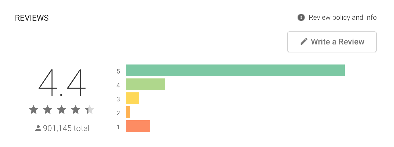
2. VOC (2020.06~2021.06) : VoC who gave 1-2 points.
Rank #1. Fail to connection
Rank #2. Unclear visual cue between working and ceased working devices.
Rank #3. Whenever users try to use in-app service of SmartThings, service says that users need certain type of device
Insight : Main target is ‘Device owner’ rather than users who just share devices.
1) Providing easier setup
2) Clear Visualization is needed
3) Supporting in-app purchase, and OOBE for using in-app service when users buy new device.
Information Architecture
Favorite for users who have multiple devices
Devices for control device and add.
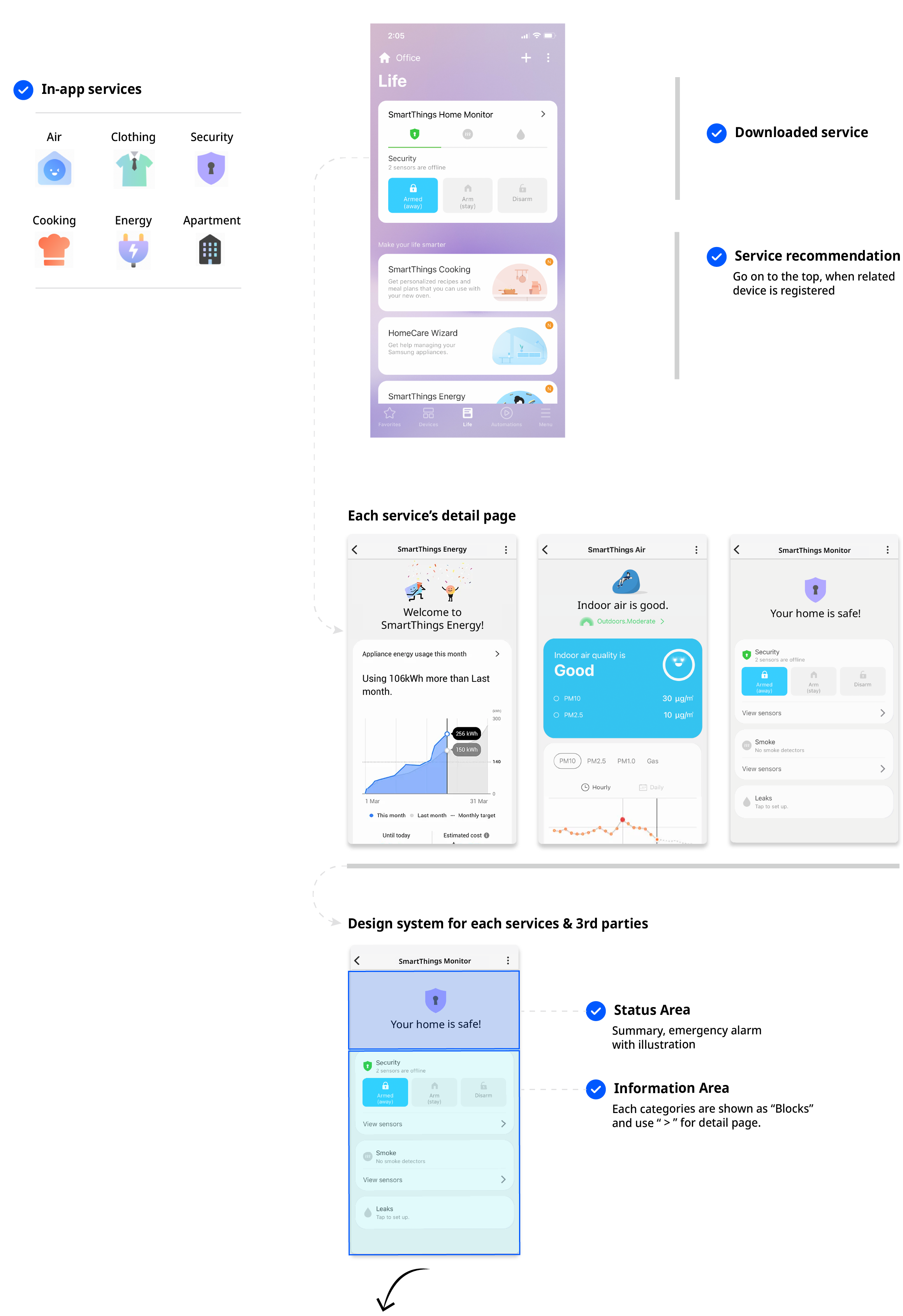
Life for in-app services such as Energy / Clothing care / Air control.
Routines for checking automation at once and edit.
Menu for all general settings, mall, and advanced features.
--
--
Design Output
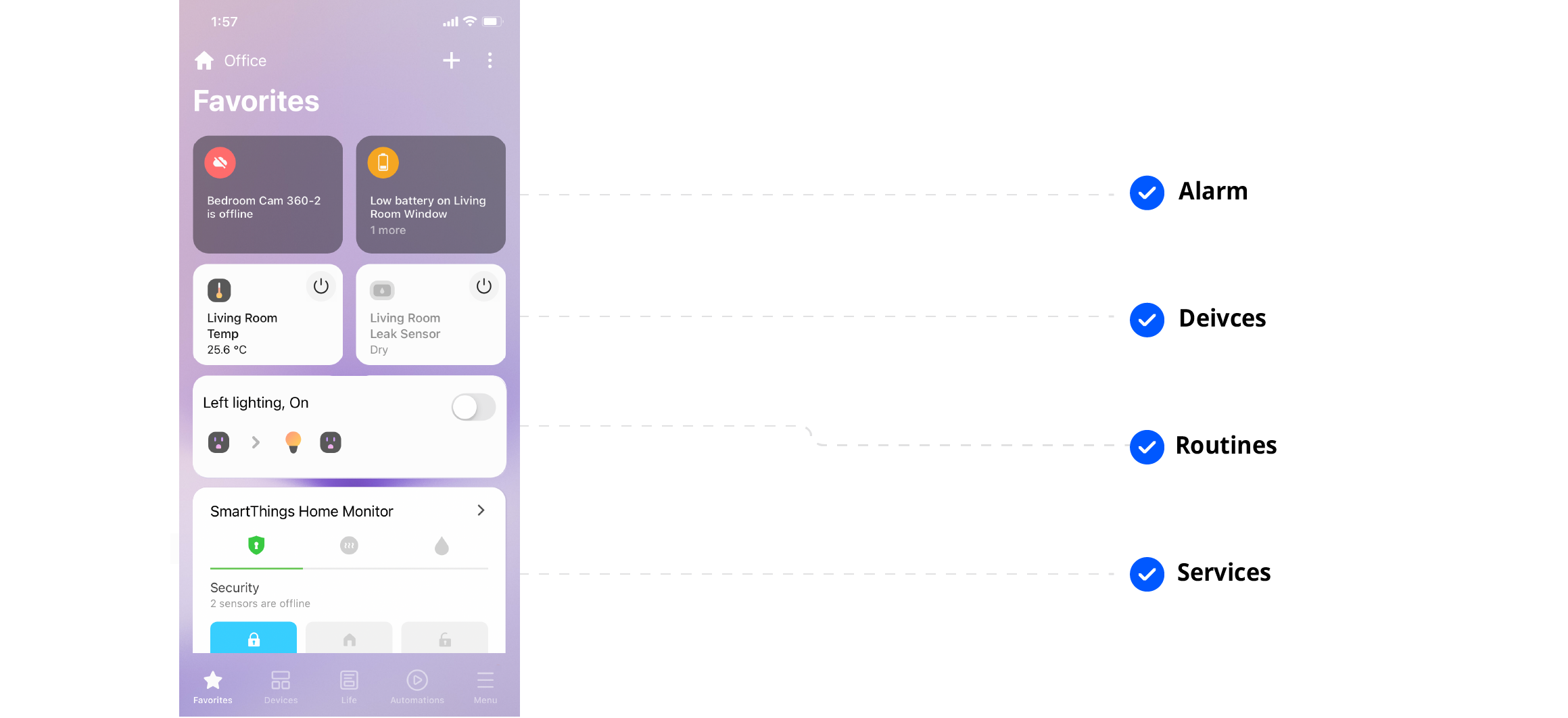
Feature 1. Five tabs
No more hamburger menu. User can find what they want by using tabs. All tabs reflect our design strategy as below.
Feature 2. Set favorite
For users who have multiple devices, they can ‘pick frequently used device’. This page serves as a “home”, so users can check emergent alarms or weather in this page.
Users can make customized page by choosing frequently used devices or services.
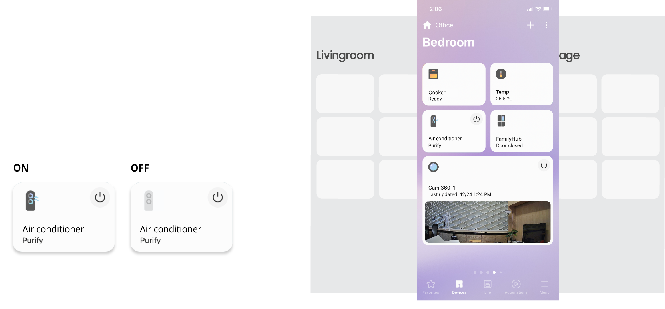
Feature 3. Device control
In “Devices”, users can check the status of devices and easily turn it on and off.
Running devices are colored and animated, but stopped devices are gray.
Check the status of devices : Using animation.
Feature 4. Explore integrated management
There are diverse in-app services that users can use freely. For example, if users want to save their energy, they can down load app and check how much it would be cost in this month, and activate ‘energy saving mode’.
In the Life tab main page, they can see other services features. Also, when user set up a certain device, service card which support that device comes to top with visual signal.
+ Design system toolkit for 3rd party
SmartThings’s “Device plugin” supports all 3rd party devices. Therefore, design guide for template is needed. I also participated as an UX designer for two month. It defines not only header or graph types, but also text lengths and depth of screens.
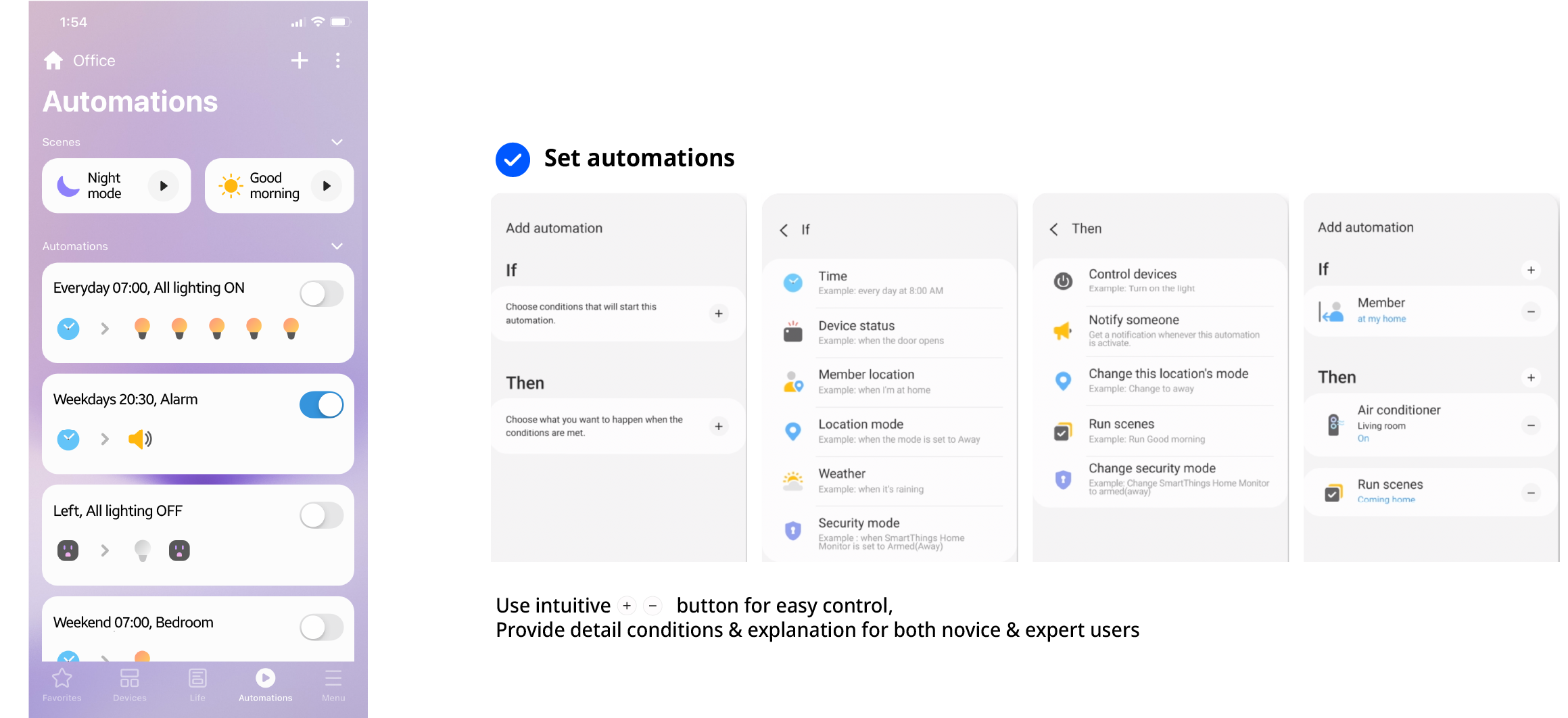
Feature 5. Automate control your home
Syncing multiple devices into seamless action. By setting pre-conditions, user can automatically manage their home. (e.g. If you leave home, then the locks will activate automatically)
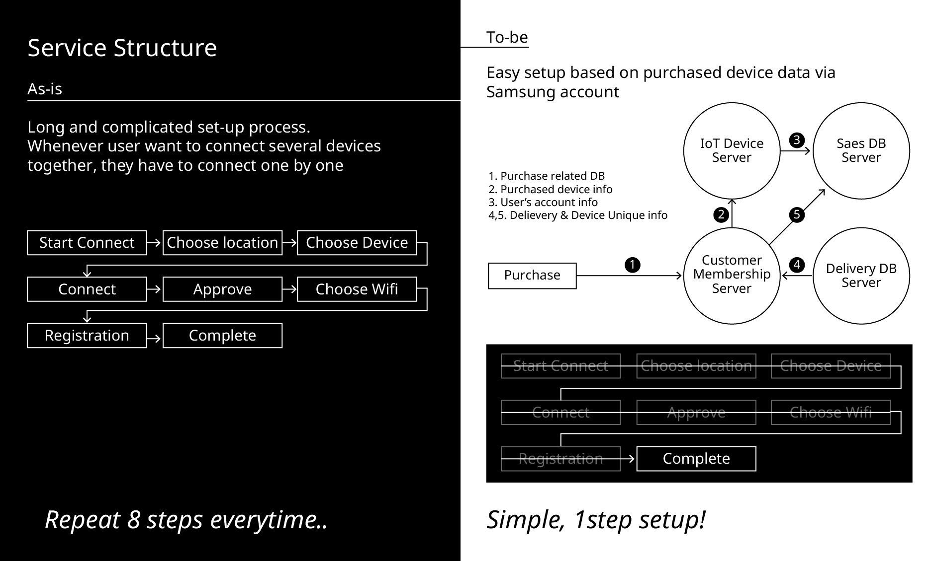
Feature 6. Easy set up
I was in charged of “Setup” for a year and there are three ways for setup: Setting up device by manually clicking buttons, using QR code, or Bluetooth.
-> For easier setup based on customers’ data, I designed account-based solution:
When users buy devices at Samsung website or retail shop, they can add devices thanks to account information in one-step.
After a transaction, Information of device is automatically delivered from the Samsung retail server to the SmartThings app, and users can see that device as a ‘Virtual device card’. Users can add devices by clicking virtual cards.
I participated as one of the main designers, and won at the Good Design Award 2021- service category.
Feature 7. Easy onboarding _ Virtual Home
When user firstly register or invited, they can explore demo control page although they don’t have any device. By doing this, they can understand the value and concept of this app’s UX.
However, I didn’t think it was the best OOBE solution.
I thought that users can't get any motivation to connect devices by just checking the device's on / off image. Advanced UX design for helping users understand how device automation can work in their real-home can make motivation for users to connect devices and start to use frequently.
Therefore, I suggested an AR version of Virtual homeas an UX leader Where users can virtually place several devices at their home and learn what synergies can be created. You can check more at this page.
--
--
Usability testing / App release
2 weeks : usability testing -> 1 month : conducting FGI and Improve UX > 1 year : app release and update UI based on VoC
Usabaility testing
+75% Valued higher!
Participant : 20~40 old, Korean 45, The U.S 50 users.
7 point scale
75% users were more satisfied than previous version
74% users were satisfied with 5 tabs
“ Much easier to check! I can check all features (device / routines..) at once”
“It clearly shows which devices are operating, and how much time left”
“This new Favorite Tab makes me to find important devices quickly without scrolling down.” - Michael
“Swiping rooms in Device tab is familiar and intuitive'
App release
+5,000,000 Download
It all begins with an idea. Maybe you want to launch a business. Maybe you want to turn a hobby into something more. Or maybe you have a creative project to share with the world. Whatever it is, the way you tell your story online can make all the difference.
Next step : Design lead
@Routine Builder for smart home automation. @ iF Design Award 2022
It was a great pleasure to renewal the whole app which is used by 5,000,000 people around the world. I could design based on real users’ voice and SA logging of previous version. Also, by developing UX with usability testing, I could learn the difference between “innovation from designer, manager, developer” and “users’ convenience,”
However, there are still difficulty in making “routines” among novice users. Also, operating services are shown in only “service tab”, and SmartThings can’t link several services together are remaining problem.
Therefore, to solve these problems, I worked on advanced project as a team leader, and it won at 2022 iF Design Award. You can check project in below link :)


